
How can we help Siri QA testers spend their day testing instead of copying data between tools? The macOS app they used every day had grown one feature at a time, and it was time for a redesign.
Contribution
Product Designer, UX & UI
Redesign lead
Tools
Sketch
Xcode
SwiftUI
Claude Code
Note
Under NDA. All visuals are illustrative schematics with sample data, not the shipped interface.
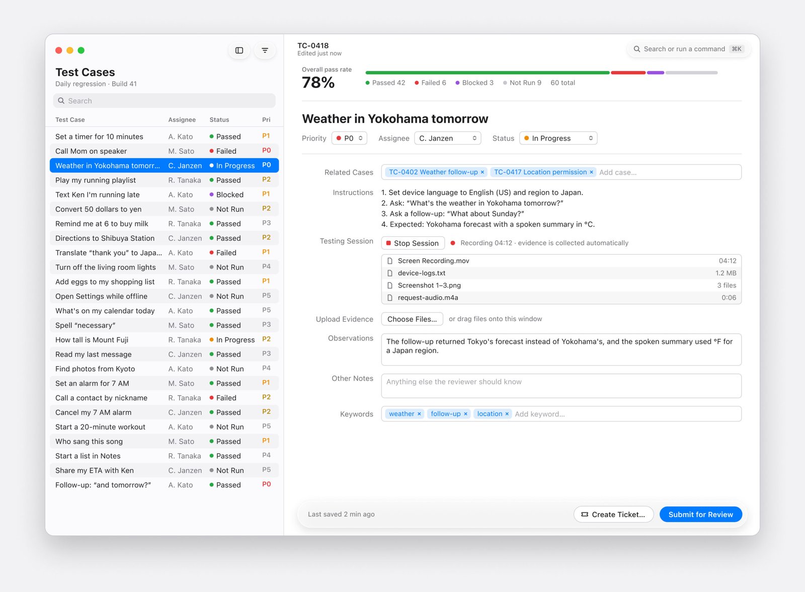
Schematic of the redesigned testing window: test cases on the left, the selected case and its form on the right
I led the redesign of a native macOS app that Siri QA testers use to run test requests, record findings, and report defects. Since the tool was already in daily use, I started with field studies and user interviews to discover the pain points users experienced.
Saving time - Carrying test data straight into the ticket
When a test failed, testers filed a ticket in a separate tracker. A failed test already holds most of what a ticket needs: the test case, request, build, device, language, region, steps, and recordings. Testers were typing all of it a second time.
In field studies, I watched triagers copy details from previous tickets, or from the app into the ticket, and sometimes miss things. Leaving the test run also broke the tester's place in the test pass.
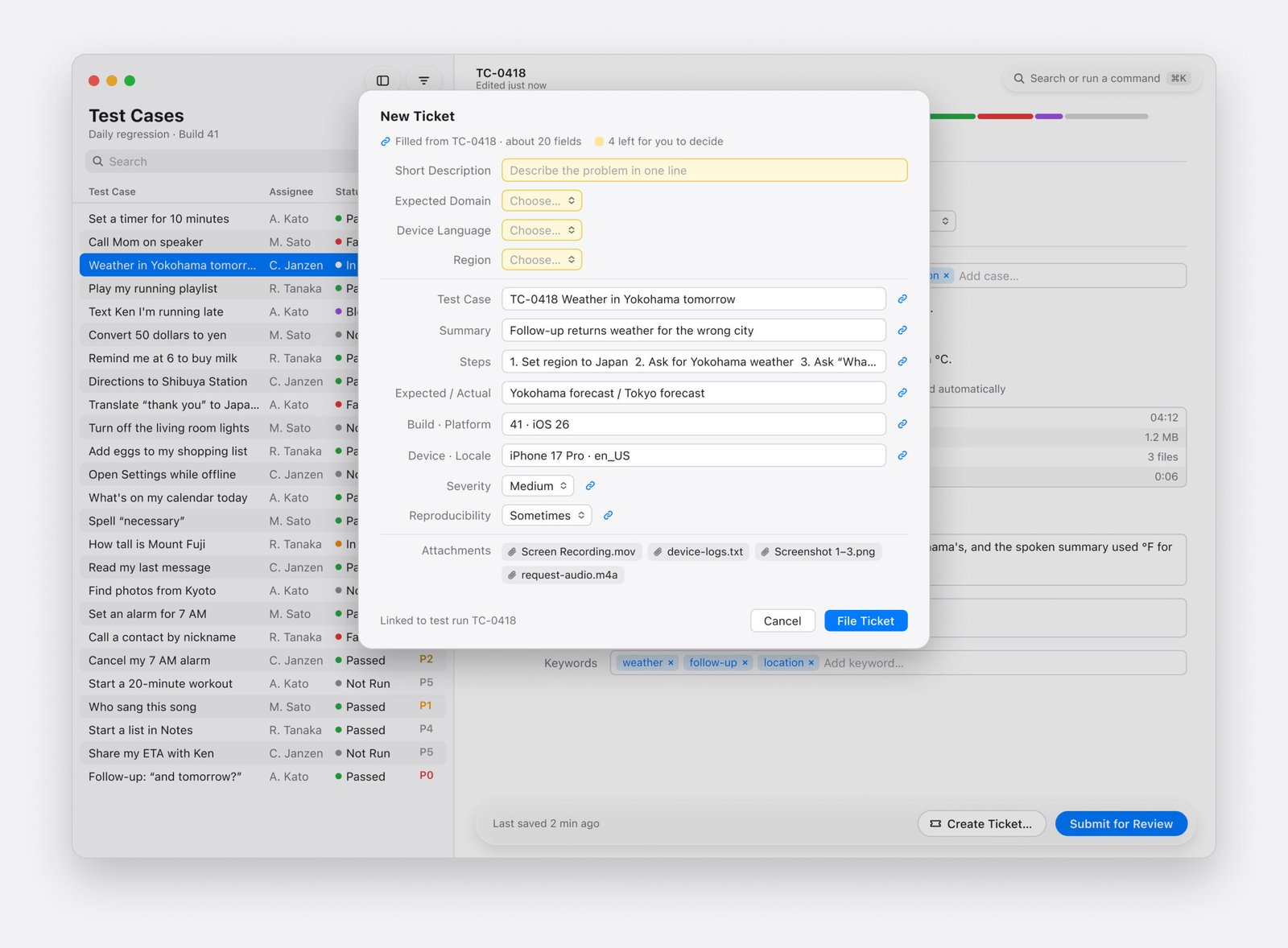
Create Ticket fills about 20 fields from the test run and leaves 4 for the tester to decide
I added a Create Ticket button to the footer of every test case, next to Submit. It opens a ticket sheet already filled from the run, and the tester reviews and files it. The ticket links back to the run, so neither side loses the connection.
All fields that could automatically pull data now from the test preopulate including attaching test evidence such as the recordings, logs, and screenshots collected during the testing session.
Finding features faster - One command bar instead of dozens of shortcuts
Every new feature had added another menu item or keyboard shortcut. Experienced testers memorized them; new users searched through menus by hand and often didn't know a feature existed.
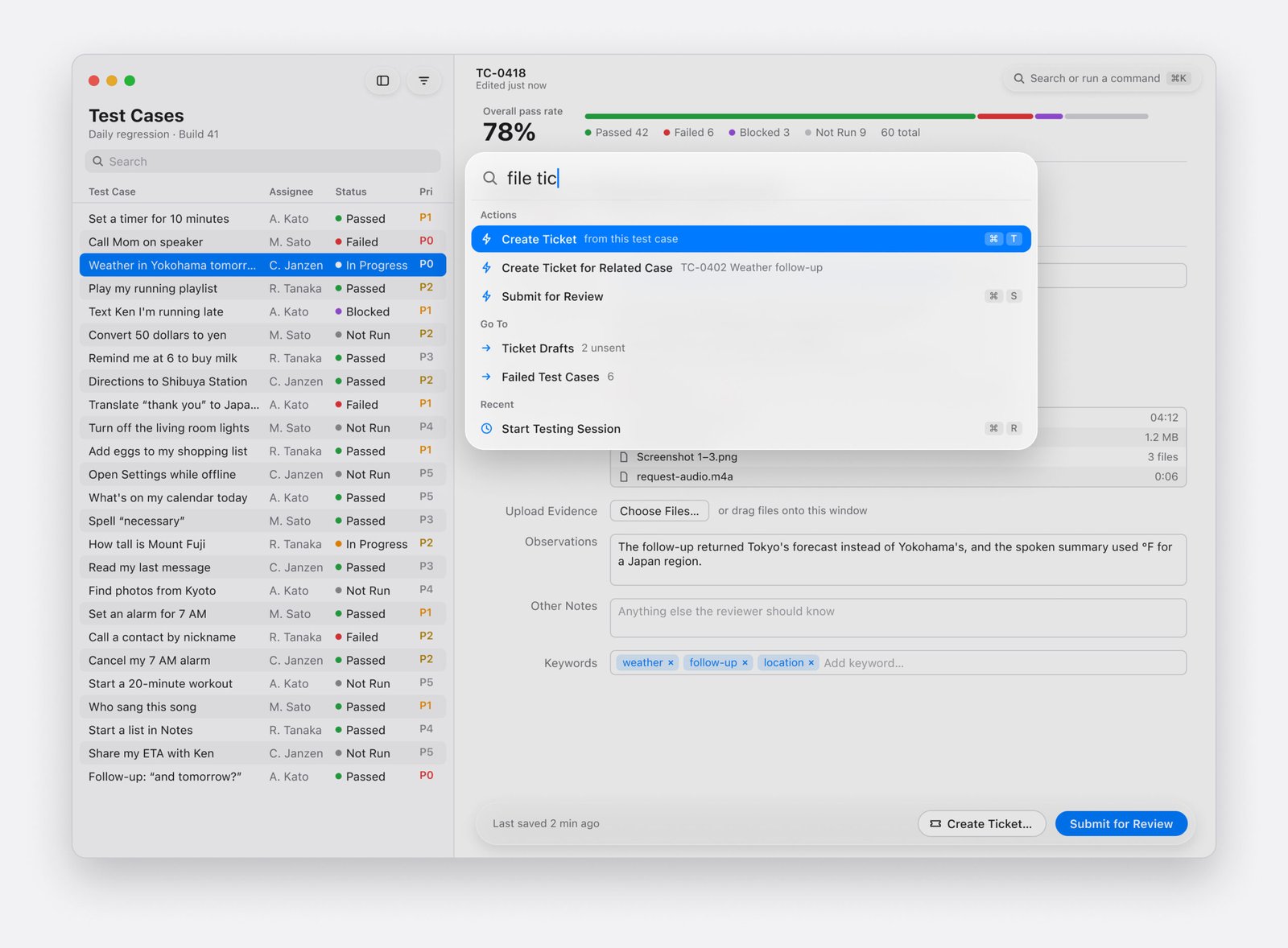
The command bar finds actions by name or intent and shows each action's shortcut
I designed a command bar that opens from anywhere with ⌘K. Testers type a few letters of what they want, and the bar finds the action, even by an alias or a verb. Each result also shows the action's own shortcut, so testers learn them naturally as they work.
An empty bar shows each person's recent and frequent actions. I also implemented a registration pattern so every new feature appears in the bar from day one.
Keeping it consistent - Building a component library to speed up development
The same button looked different from screen to screen, and every new screen started from zero. To make the redesign hold, I built a component library in both design and code.
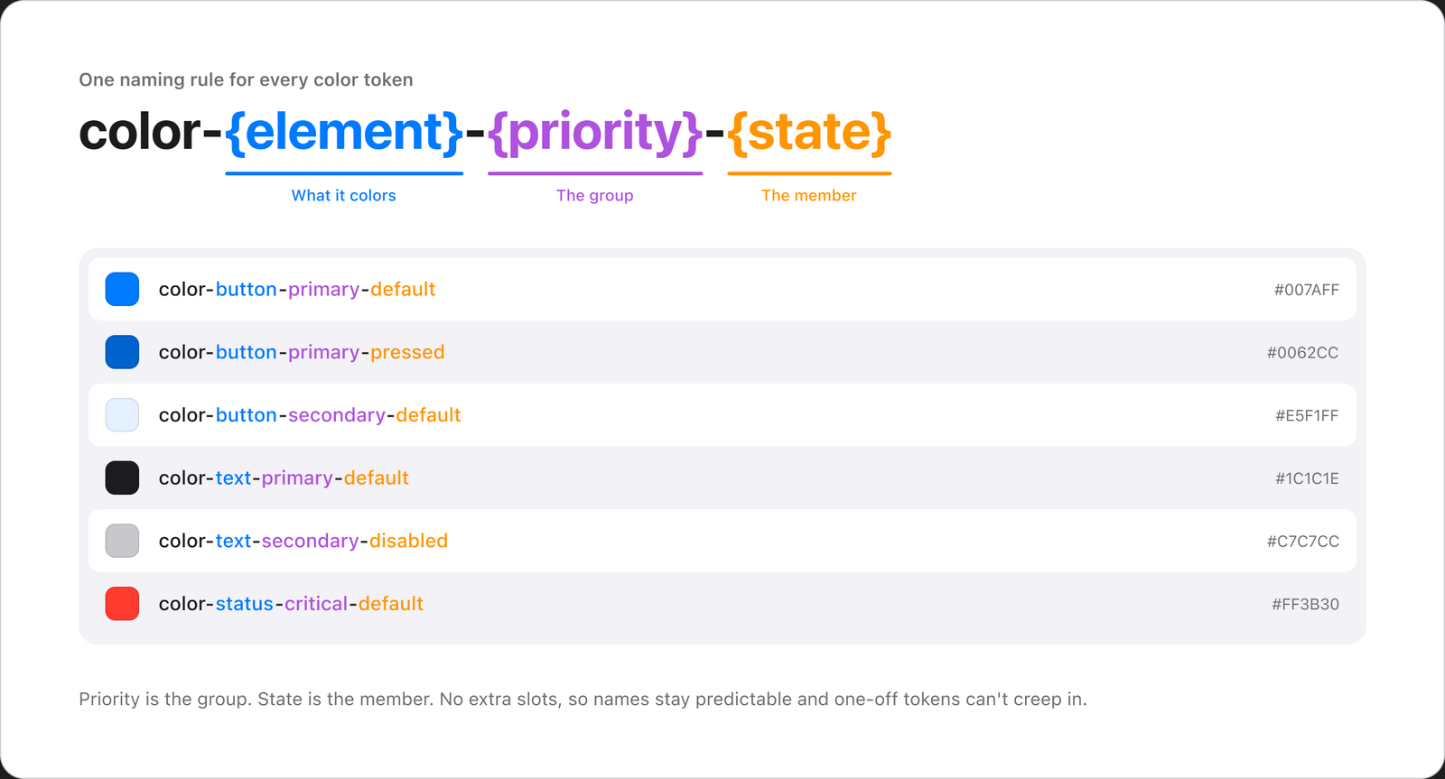
One naming rule for every color token
I audited every existing control and grouped them by the job they do, which exposed duplicates their names had hidden. Color tokens follow one naming rule, color-{element}-{priority}-{state}, which kept the set small and ended naming debates. Each component covers every state, light and dark appearances, and guidance on when to use it.
Constraints - Redesigning a tool people use every day
The biggest constraint was that the tool was live. Testers couldn't stop testing while we rebuilt it, so screens moved to the new components in small, reviewable steps instead of one large change.
The design and coded libraries also had to stay in sync. I audited them against each other regularly, so the library developers built with always matched the designs. Keyboard navigation, VoiceOver labels, and contrast were checked throughout.
Results - Less copying, better tickets
Filing a ticket now takes 3 clicks, with about 20 fields and all session files handled for the tester. Before the redesign, filing a ticket took 2 to 5 minutes on average. Triagers now report that far fewer tickets come back for more information when they're filed through the tool.
All tokens have been migrated, and about 90% of components now use the updated library. Every new feature is built with the new components; the rest are waiting on legacy code cleanup.