
How can people trust a team of AI agents they can't see working? AI agents now analyze failed test runs and propose causes, and the team needed one place to watch, approve, and steer that work.
Contribution
Product Designer,
UX & UI
Product design & design system
Tools
Sketch
JavaScript, HTML & CSS
VS Code
Claude Code
Status
In progress. Version 1 of the design system is built and the product is in active design.
Note
Under NDA. All visuals are schematics with sample data, not the shipped interface.
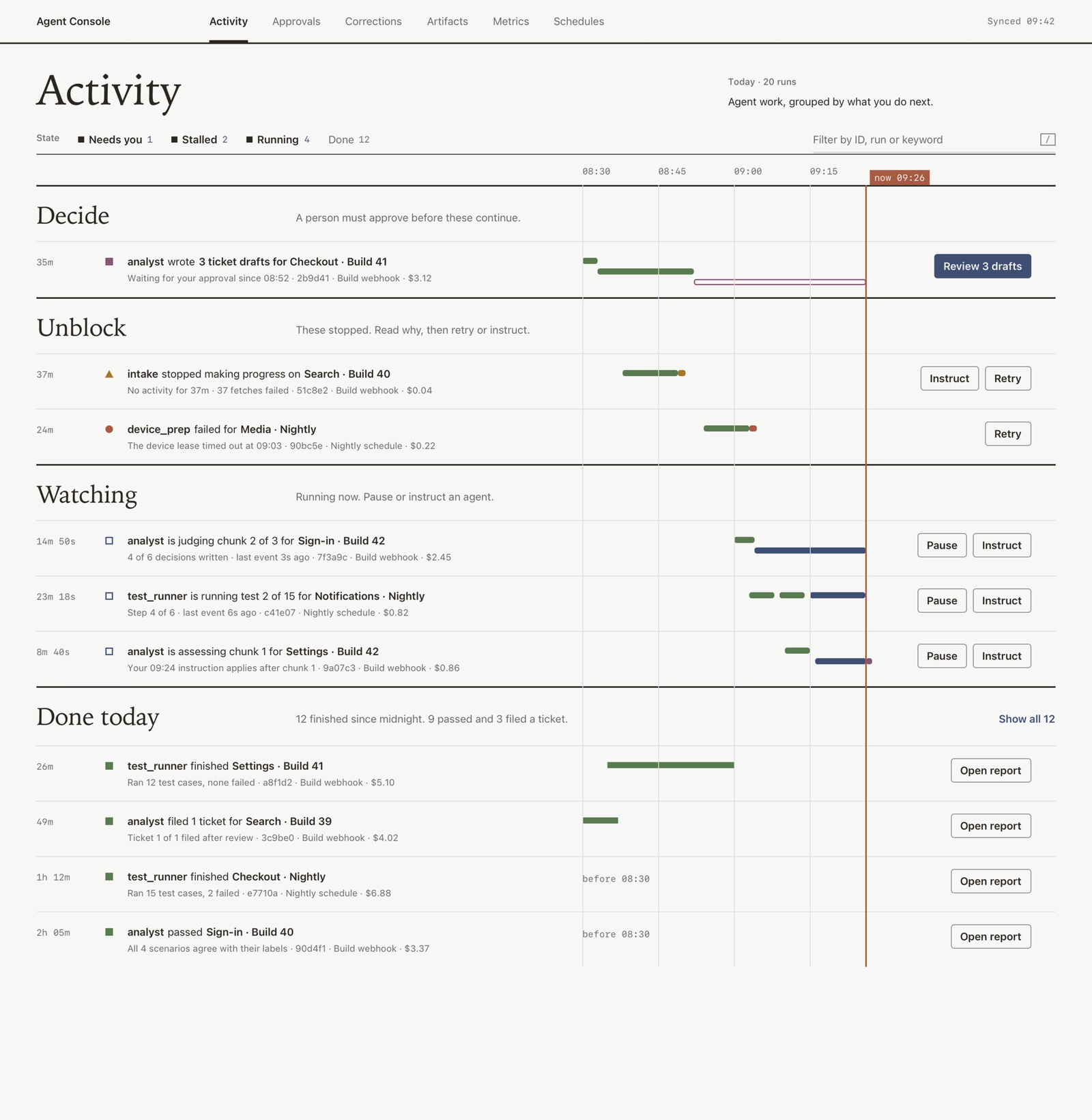
The activity feed groups agent work by what a person needs to do next
AI agents read failed test runs, group the failures, and propose a cause and next step. Three tools had grown up around them in parallel: a live dashboard of agent activity, a triage viewer for one analysis, and a run explorer for individual test runs. Each had its own look and logic, and only the dashboard could act on an agent.
I'm designing the product that brings them together, starting with its design system.
Building the foundation - A design system for three tools at once
The same status word had a different color in each tool, and no component was shared. Rather than redesign each screen and reconcile them later, I built the design system first, from scratch.
I cataloged every component across the three tools by the job it does, which made the duplicates obvious. Then I built new tokens for color, type, and spacing, and a shared component library on top of them. Every status color is defined once and means the same thing in all three tools.
Because the product is still taking shape, I treat the system as version 1. When something needs redesigning, I log it in a backlog instead of patching it in place, so the system stays coherent while it grows.
Making agent work visible - Showing evidence before the verdict
People couldn't tell what an agent did, why it did it, or how sure it was. Without that, they couldn't trust its conclusions.
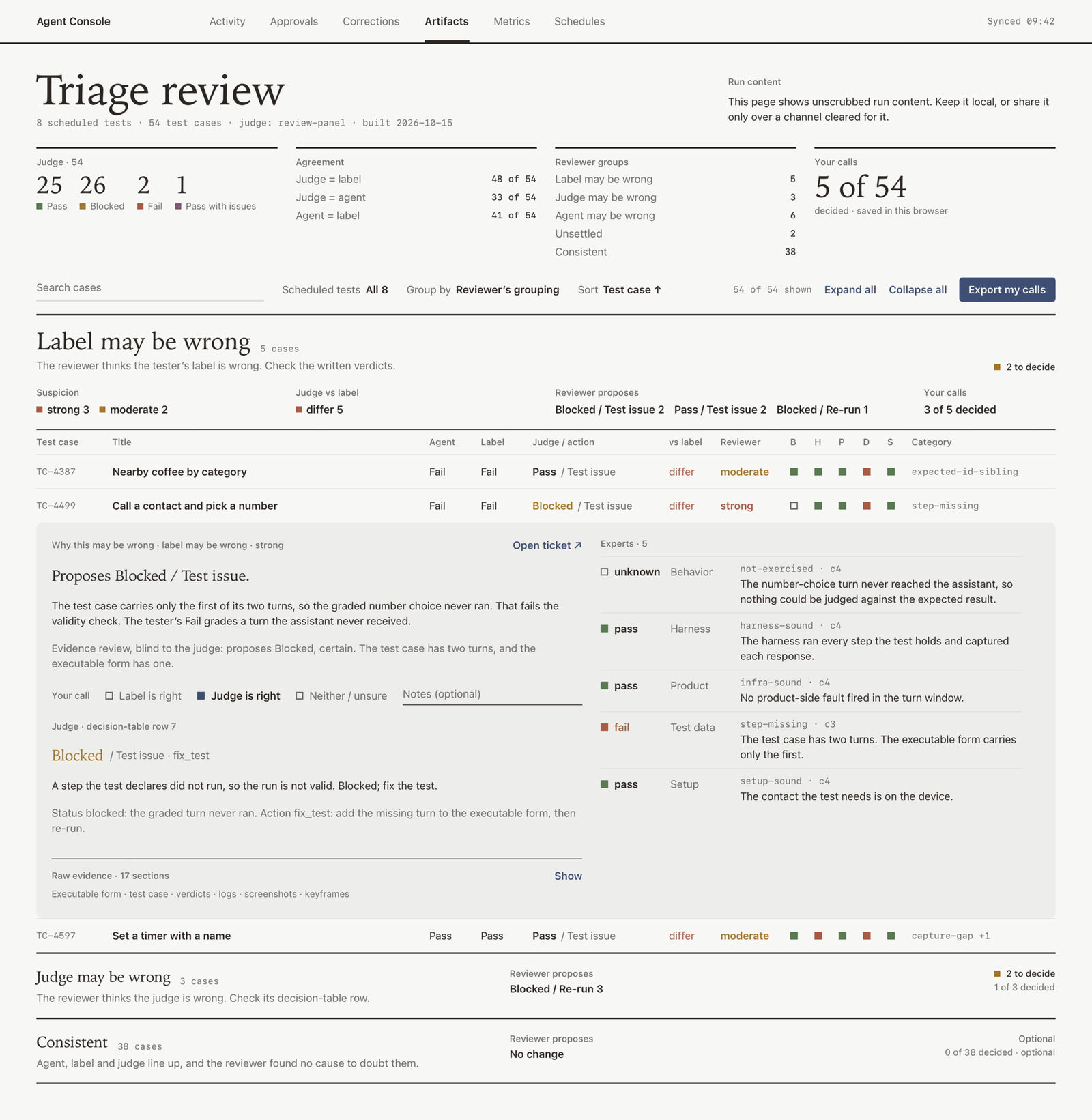
Triage review shows agreement and evidence before asking a person to decide
I designed each view to show the evidence first and the agent's verdict second, so people see the reasoning before the result. Every run also shows one clear state: running, waiting for a person, paused, stopped, failed, or done. From the same card, people can open the full evidence in the triage viewer or run explorer, so the three tools read as one product.
Keeping people in control - One place to start, approve, and stop every agent
Starting, pausing, approving, and correcting an agent used to happen in different places, and some actions were only possible through scripts.
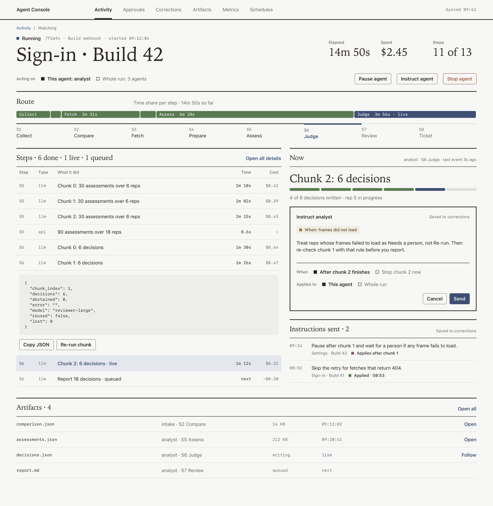
Run detail brings a run's state, evidence, and controls into one view
The command center brings all of it onto one surface. People can start an agent from a form built from its own inputs, approve or reject proposals in a queue, and redirect or stop a run at any time. Agents only propose; a person confirms anything that changes state. When someone overrides an agent, the correction sits next to the action it changed, so the team can learn from it.
Designing for two users - A fast default with depth on demand
Two groups use the same screens with opposite needs. Triage engineers want to decide quickly. Quality engineers want to inspect the agents' judgment to improve them. Hiding passing results helps the first group and hurts the second.
Instead of one compromise, I designed a fast default for triage and an opt-in depth for review. I built several versions of the activity feed, kept every source filter in each, and compared them on the same task before choosing a direction.
Constraints - Designing while everything is still moving
The biggest constraint is that everything is changing at once: the agents, the data they produce, and the system itself. I design from the users' tasks rather than the existing code, which will be replaced anyway.
Accessibility is the other priority. Keyboard access, focus indicators, and reduced motion all need fixing across the three tools, and the new system builds them in from the start.
Where it stands - Work in progress
Phase 1 presentations are complete. The screens I designed helped get the tool greenlit for continued development, and the work continues into the next phase.